A small space for me to post and talk about my photography work, reviews on photographers, artists and current exhibitions... actually lets just talk about anything.

Monday, 27 April 2015

Pick Me Up Exhibition at Somerset House

Pick Me Up has been a regular event hosted at Somerset House for 6 years now but it is beyond me why I haven't stumbled across it before. It hosts a range of work from graphic designers, photographers, illustrators and artists, as well as up-coming shops and some pop-up stores as well. To visit the exhibition you can pay an entrance fee of £10 (£8 concessions) however this allows you to only see the exhibition one time and this is where a clever sales pitch has come in. Due to the fact that the exhibition has live speakers throughout the day, it changes speakers throughout the short time that the event is on, therefore Somerset House sells a 'festival ticket' for £17 (£14 if you got it a week before the event) which allows unlimited entry into the exhibition. This is a much better cost option if you a planning on visiting it more than once.

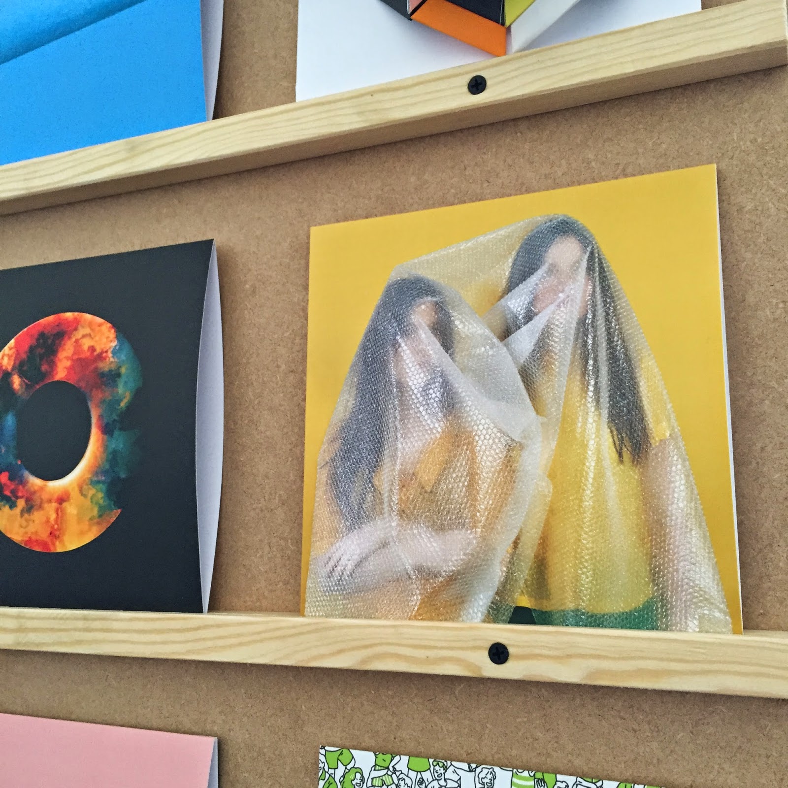
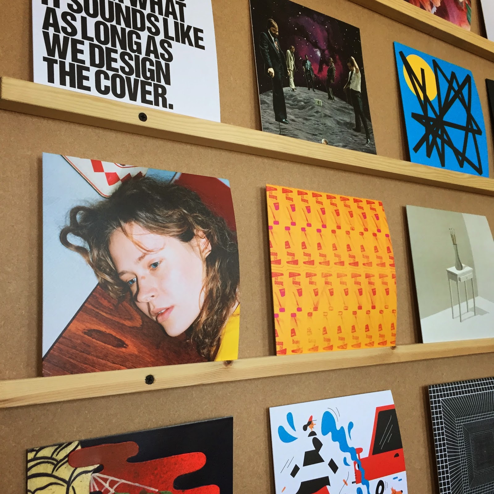
The work displayed in the main section of the gallery is from Gaurab Thakali, Hattie Newman, Jack Cunningham, Jennifer Argo, Laura Callaghan, Laura Jouan, Luke Evans, Peter Judson, Rop van Mierlo, Sara Andreasson, Thomas Lamadieu and Zoe Taylor, all of whom I've collected my favourite piece from each of them into a small collection for showcasing the range of techniques, styles and art across the exhibition (below).

A piece of work from each artists. From left to right and top to bottom: Jennifer Argo, Laura Callaghan, Peter Judson, Sara Andreasson, Rop van Mierlo, Zoe Taylor, Hattie Newman, Laura Jouan, Gaurab Thakali, Luke Evans, Thomas Lamadieu and Jack Cunningham


This section of the exhibition was inspiring and eye-opening to a range of new methods of creating art such as Luke Evans who uses an old laser printer and static electricity and Jack Cunningham who used a 3D printer. I loved the small sections set up in the centre of the room showing the artists, tools, equipment or thought processes around their ideas. Below are pages from Peter Judson's notebook and I love the satirical aspect to them.

'Why is scale important? Visual representation of how much procrastination took place.'
To-do list: what he should be doing vs what he actually does
The next section of the exhibition is held above all the artists' work displayed below. Up the stairs is a relatively narrow corridor, with a high ceiling, that has the selection of up and coming designers and graphic companies selling their work. But these are no ordinary shops, they display their work but you can also meet the designers/shop owners and talk to them about their products. As well as that many were making custom made items and there were lots of interactive aspects. From getting a graphic design taro reading to getting a T-shirt printed, there was so much on offer.

Following this section, but parallel to it, were the pop-up shops for example, Lazy Oaf which had a little room that was perfectly decorated. Along this corridor was also the 'Pick Me Up Platform' were the live speakers talk. I stumbled in mid-way through a talk from the political cartoonist Martin Rowson. His opinions and thoughts were truly interesting and incredibly humorous with the audience laughing at every other sentence he had to say about David Cameron/George Osbourne/Nick Clegg/the coalition/Boris Johnson or politics in general. His cartoons have such a satirical tone to them and anything that mocks the current politicians is my kind of humour. 

All in all, I thoroughly enjoyed my day at the exhibition and I may have to admit that it has been my favourite exhibition in a long time. The atmosphere was so relaxed and inspiring - I loved that it showed such a strong range of work that anyone could have found something they liked and the refreshing and current idea about having pop-up shops has set the bar so much higher for me. I simply cannot wait until I return this coming Saturday for another day.

Where: Somerset House - Embankment Galleries
Event: Pick Me Up
Nearest tube: Temple or Embankment
Cost: £10 per day/ £17 for unlimited entry
Dates: 23rd April - 4th May

Monday, 20 April 2015

Secret 7"

Hosted at my favourite place in London, Somerset House, a very unique and interesting exhibition is brought to us from Secret 7. The project is for a charity called Nordoff Robbins who transform the lives of vulnerable children and adults though music and the team from Secret 7 and Somerset House have pressed 7 well-known tracks from different music artists 100 times on to 7" vinyls (hence the name of the exhibition) and asked over 700 artists/designers/photographer/illustrators to design a vinyl cover for the track. The tracks they chose to press are Dead Flowers (The Rolling Stones), Reflections (Diana Ross & The Supremes), Born Slippy (Underworld), Let Forever Be (The Chemical Brothers), Digital Witness (St Vincent), Sledgehammer (Peter Gabriel) and Go (The Maccabees).

However, this is where the plot twist kicks in, in the exhibition you have no idea who created the cover (hence the 'secret' part of the name) - it could have been Martin Parr, Sir Peter Blake, Julian Opie or even David Shrigley - or what track it was for. You could then buy a totally unique and one-of-a-kind cover (and receive the vinyl with it) for £50 and then be told who created it and what track its for. Personally I love this idea, it minimises the stigma of buying art for the name of the artist who created, but brings it back to what art is really about, whether you like or don't like what the artists have created. Some designs you can guess what track they would be for or who created them - Julian Opie's style is significantly special and is recognisable to him. But this is rare as each idea of the covers are totally new concepts and display something different.


One part of the exhibition that I particularly enjoyed was the fact that there were several vinyl players in the centre of each room that played the tracks that were chosen.

Vinyl playing of Digital Witness by St Vincent
I think this is a very refreshing idea and makes the exhibition all that more interactive - the atmosphere was cheery and comfortable as people were free to talk and take photos opposed to the stereotypical silent and strict exhibitions that every one secretly dreads. However one critique - the headphones played the music incredibly loud which made it hard for me (who likes my music on a low and gentle level) to listen to the songs for extended periods of time. Nonetheless, I loved the exhibition greatly. Sadly though, we will never know who designed each cover and for what song it was for but this just adds to the mystery of the art.

Location: Somerset House
Nearest tube: Temple/Embankment
Running time: 10th April - 3rd May
Cost: Free


Sunday, 12 April 2015

White Balance

Understanding white balance is often a difficult concept, and googling what it is doesn't help too much either, with the definition as:

However after reading this again, it's actually quite a simple concept to come to terms with. The Google definition has complicatedly stated that the white balance is just the adjustment of tones to make a photo warmer or cooler depending on the light conditions you are shooting in.

This post is going to be a run through of how to alter your white balance settings and what effect that has on your final photo (all photos taken on a Nikon D3100).
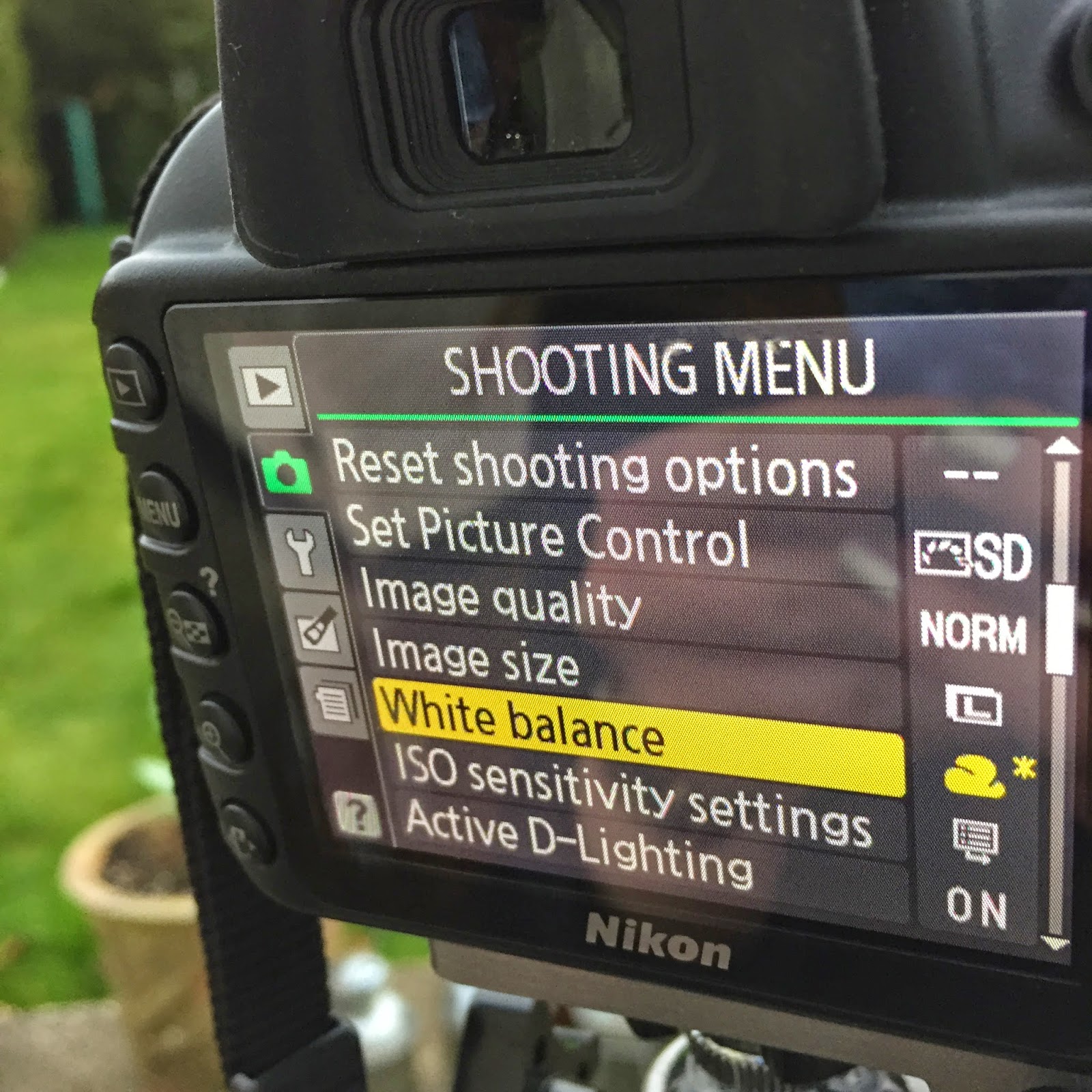
Shooting menu
Firstly you need to set your camera to Manual mode as it will allow you to adjust the shutter speed, aperture and ISO as well as the white balance. Changing the white balance is not available in other settings on the camera. Then enter the shooting menu by pressing the 'Menu' button on the side of the camera. I apologise now for people with cameras other than a Nikon as I know that each camera is slightly different and buttons might be in different places, however have I practiced on a Nikon D3300 and it is very similar. Then select the 'White balance' setting and a new window will appear.
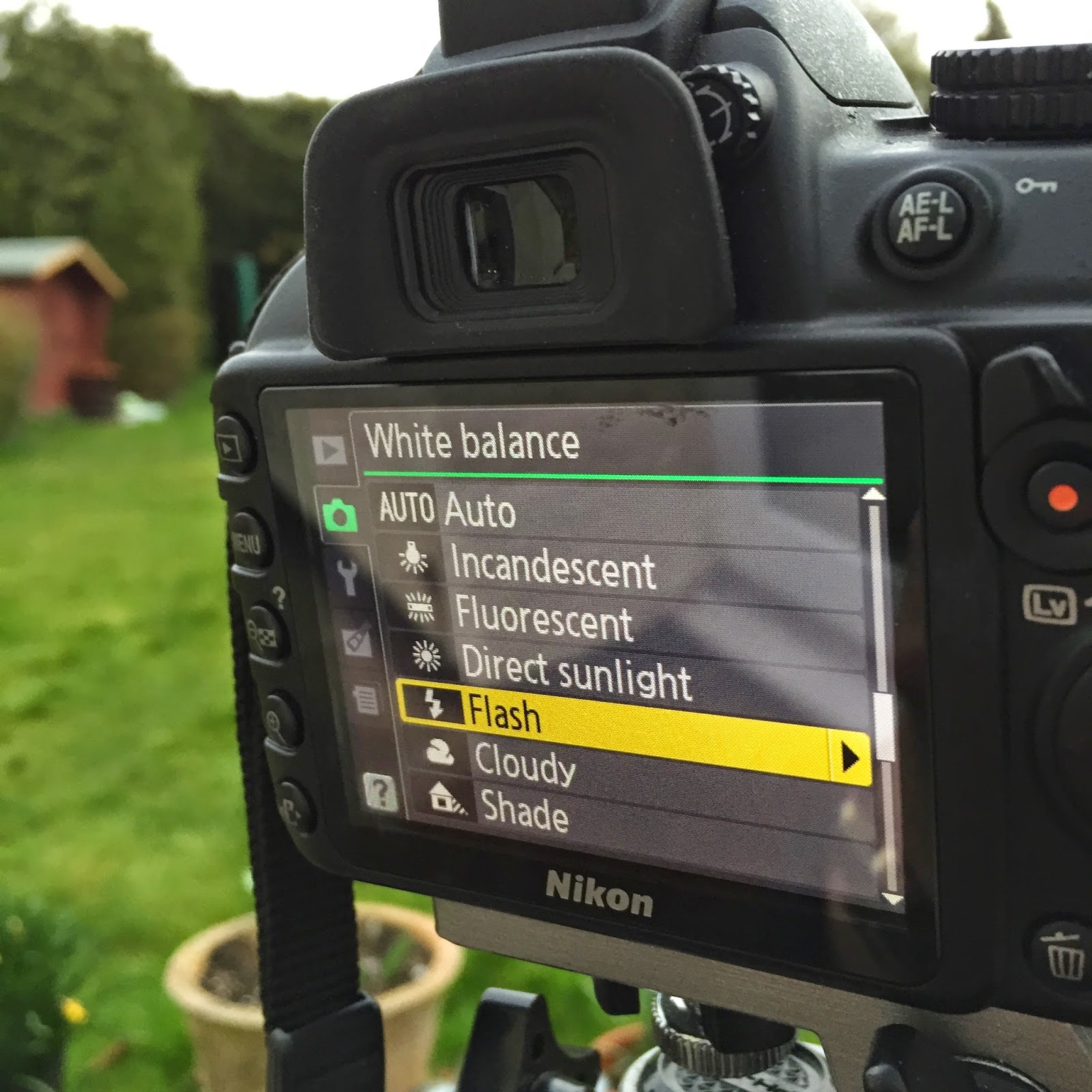
White balance menu
Once opening up the white balance option, a list of all the white balance settings appears which consists of: incandescent, fluorescent, direct sunlight, flash, cloudy and shade. It's often quite hard to find what setting you want to shoot in but the diagram below shows you the tones each setting will give. If you remain with direct sunlight you get the standard setting meaning that the whiteness in the photo is balanced creating a natural looking photograph. However if you choose incandescent or fluorescent the photograph will be warmer and the other options will give a cooler feel to the photographs.
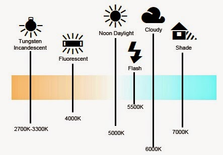
White balance diagram

After selecting the mode you want to shoot in, for example in this case I chose incandescent (it won't really show you the final effect as I was shooting in natural lighting rather than under studio lights), a grid appears with four sections marked off by the letters B, G, A and M. You can then use the arrow buttons on the back of the camera to adjust how much you want it to shift colours towards the cooler settings or the warmer settings.


Next step is to simply press OK and shoot your photo. This will obviously take some time and some practice until you find what conditions work best for you but it's always fun to experiment as some of the best photographs are always an accident.

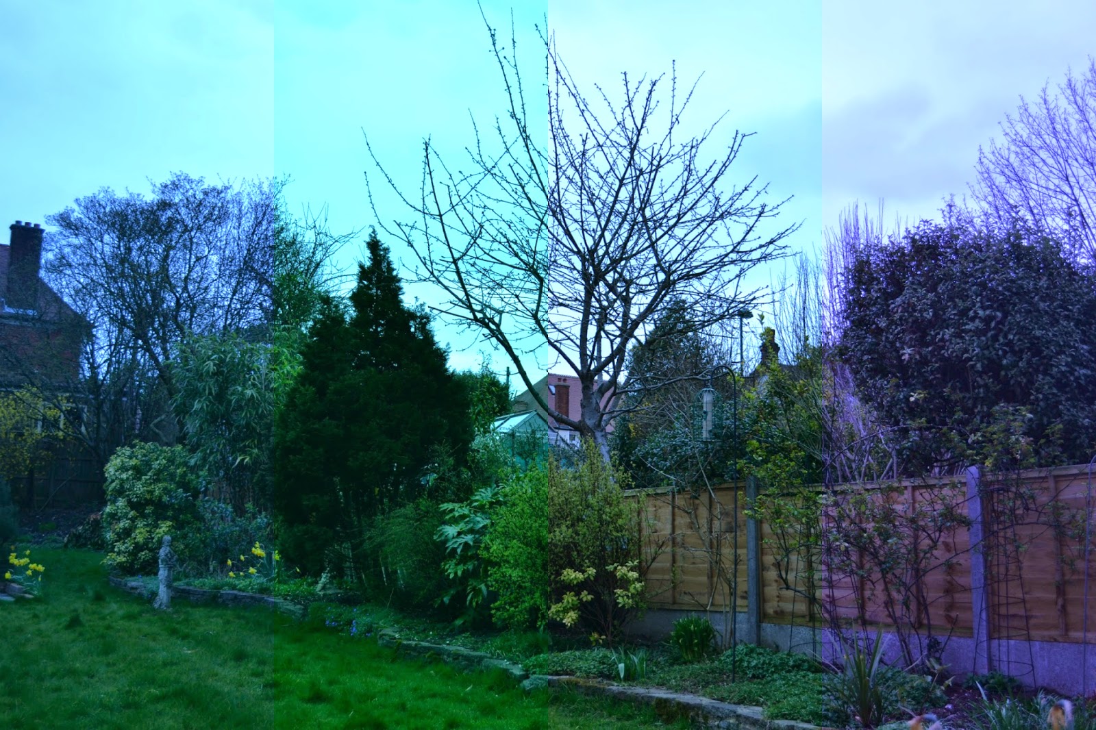
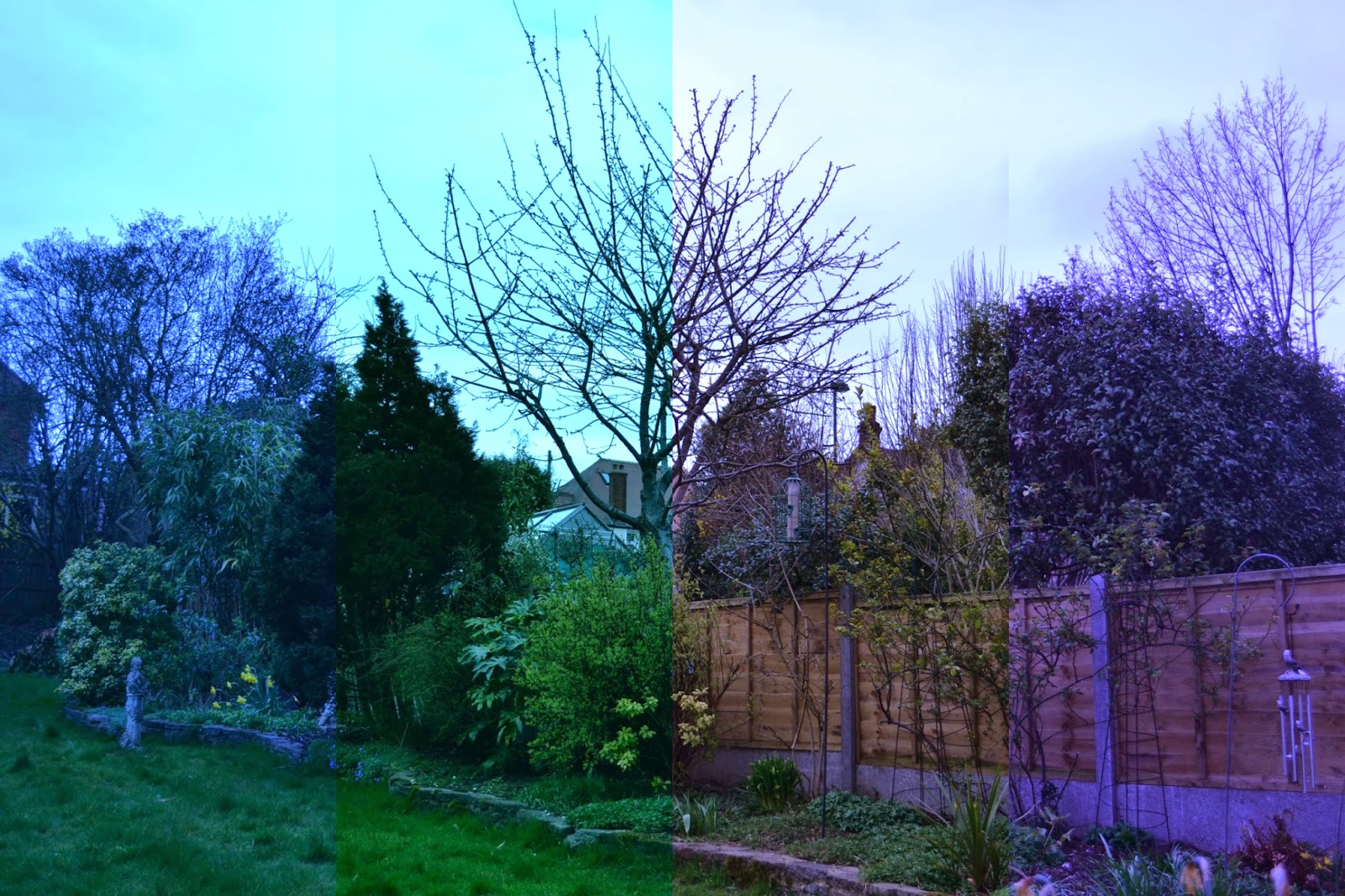
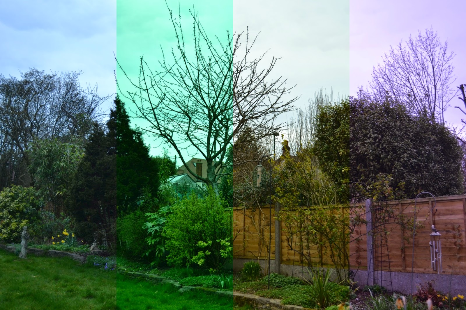
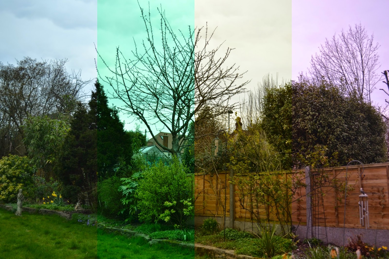
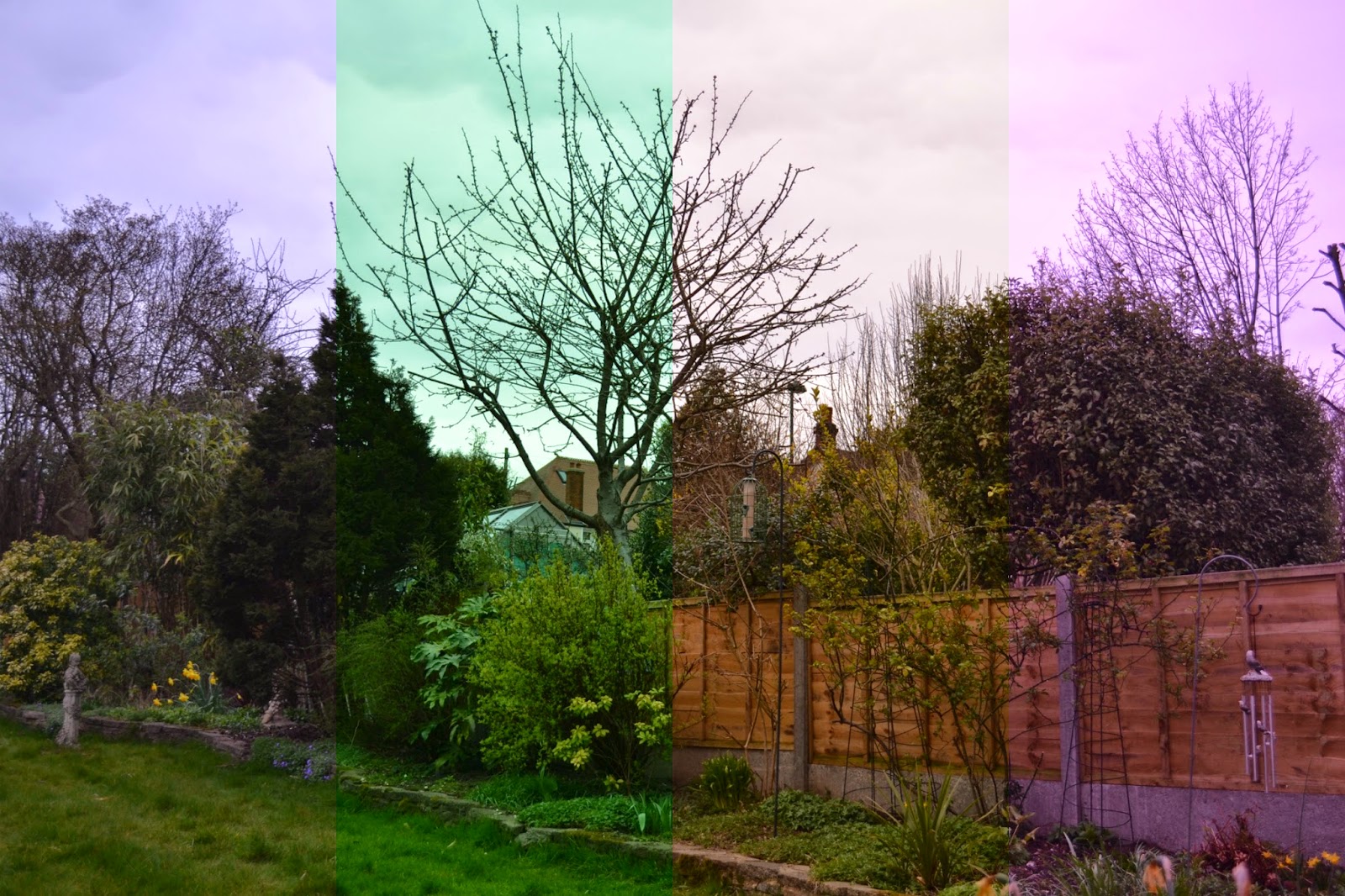
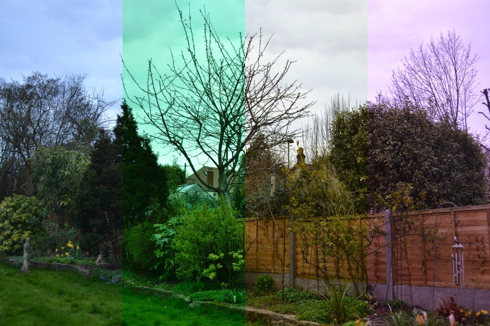
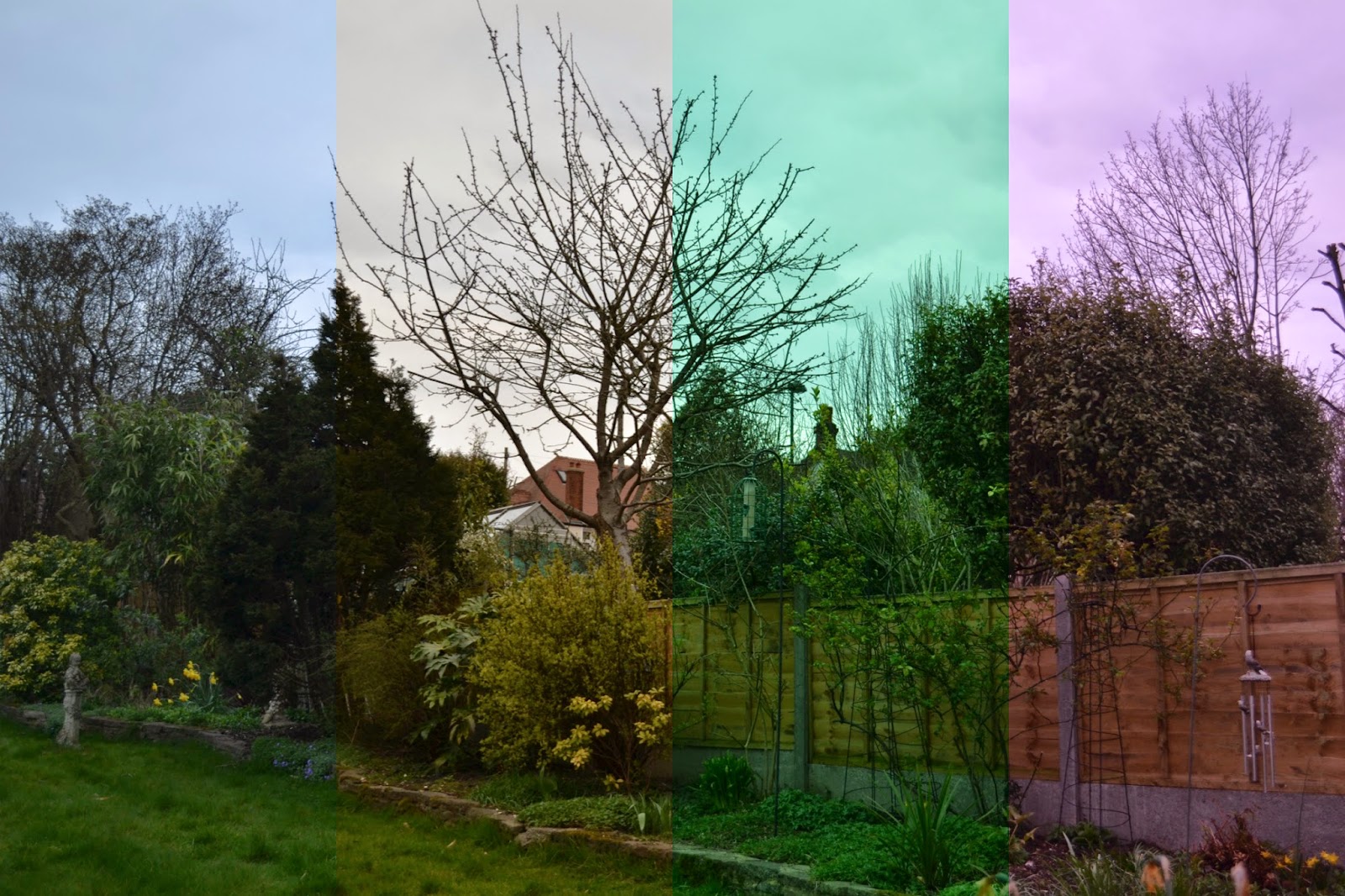
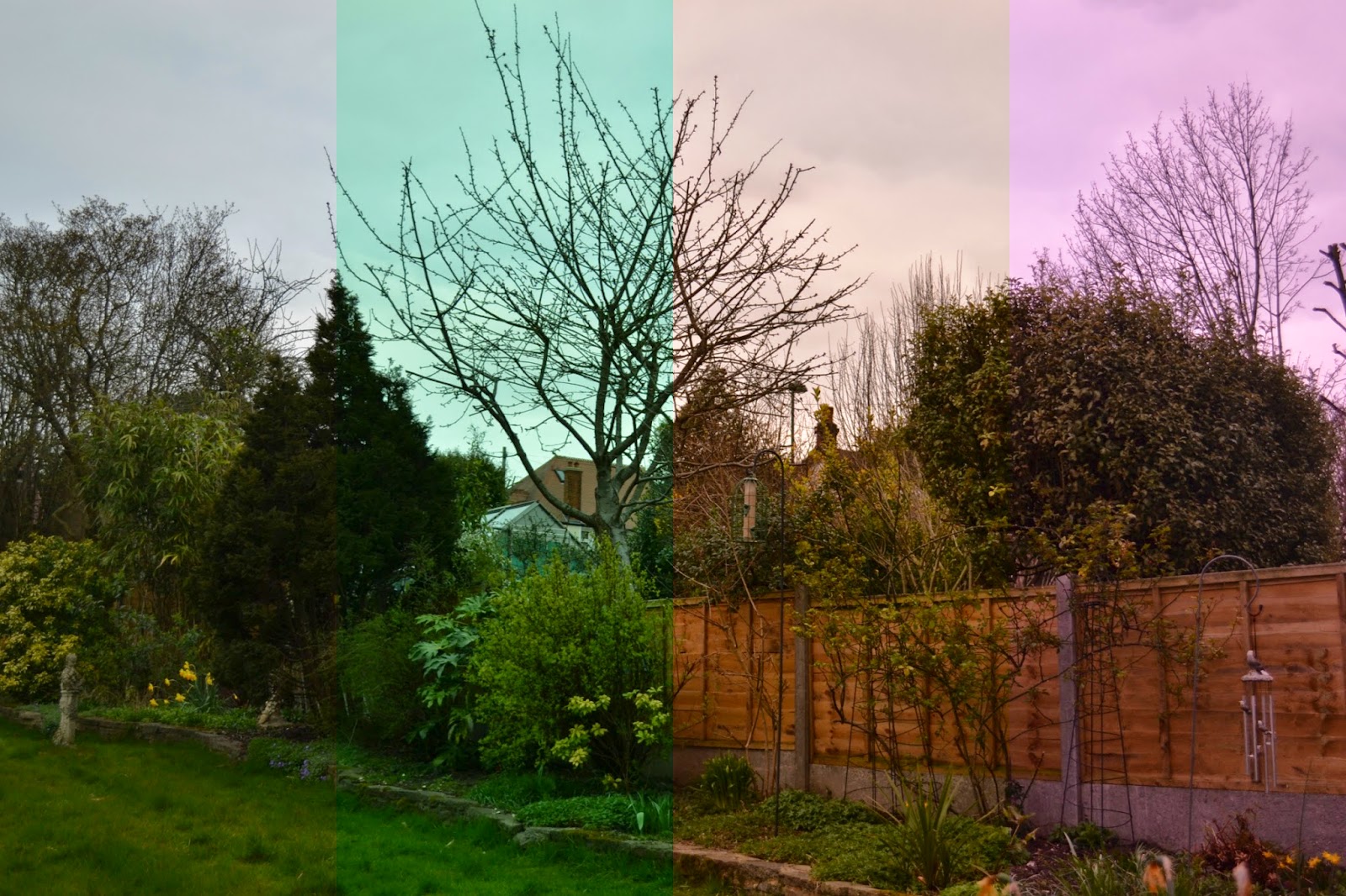
Below I will include a variety of combinations of the different settings within each white balance preference along split into four frames starting from the left with B preference, then G, A and finally M in the right hand section. There is also an overall display of what colouring you would get in a photo if you just stuck to mainly B, G, A or M on each setting. (Disclaimer: all photos were shot on the extremities of each setting so show the maximum dis-colouring the photo could have - obviously you can alter this to be much subtler).

Original settings:
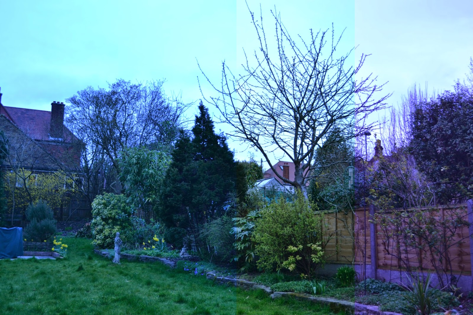


Incandescent
The cooler tones are emphasised in this setting with slight differences between each setting on the grid preferences.
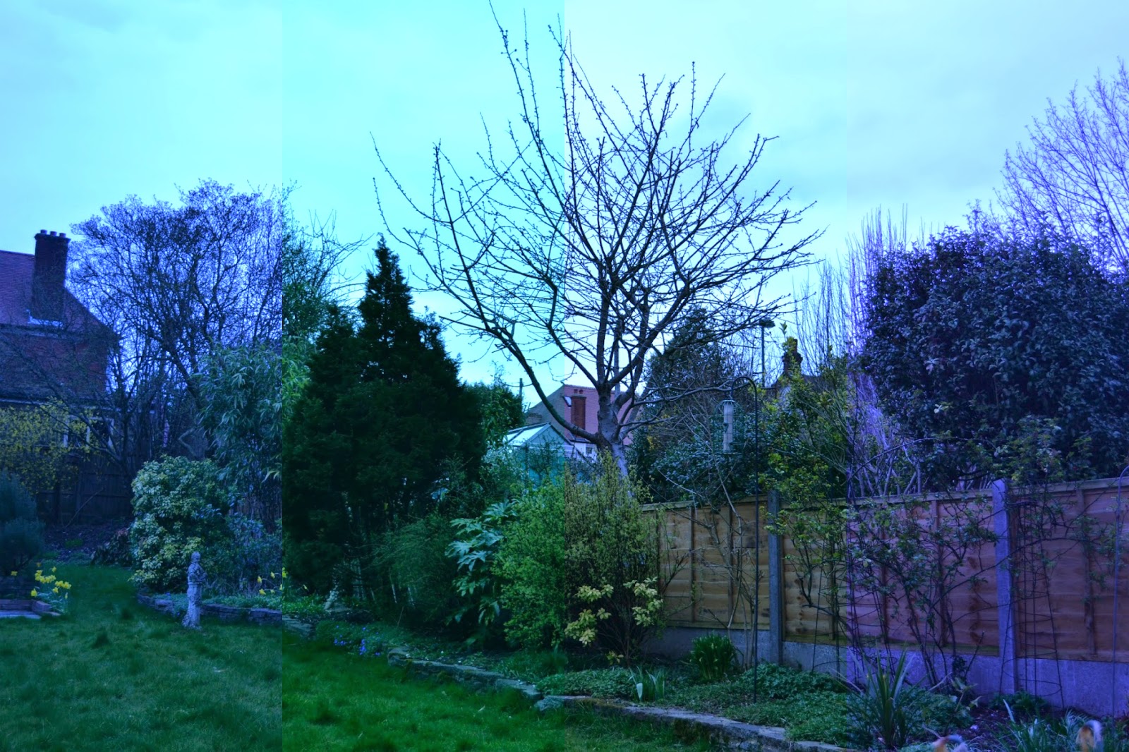
Sodium-vapor lamps
Warm-white fl.
White fluorescent
At this point there starts to be a clearer difference between the alterations of B, G, A and M, with M becoming a lot more of a purple shade.
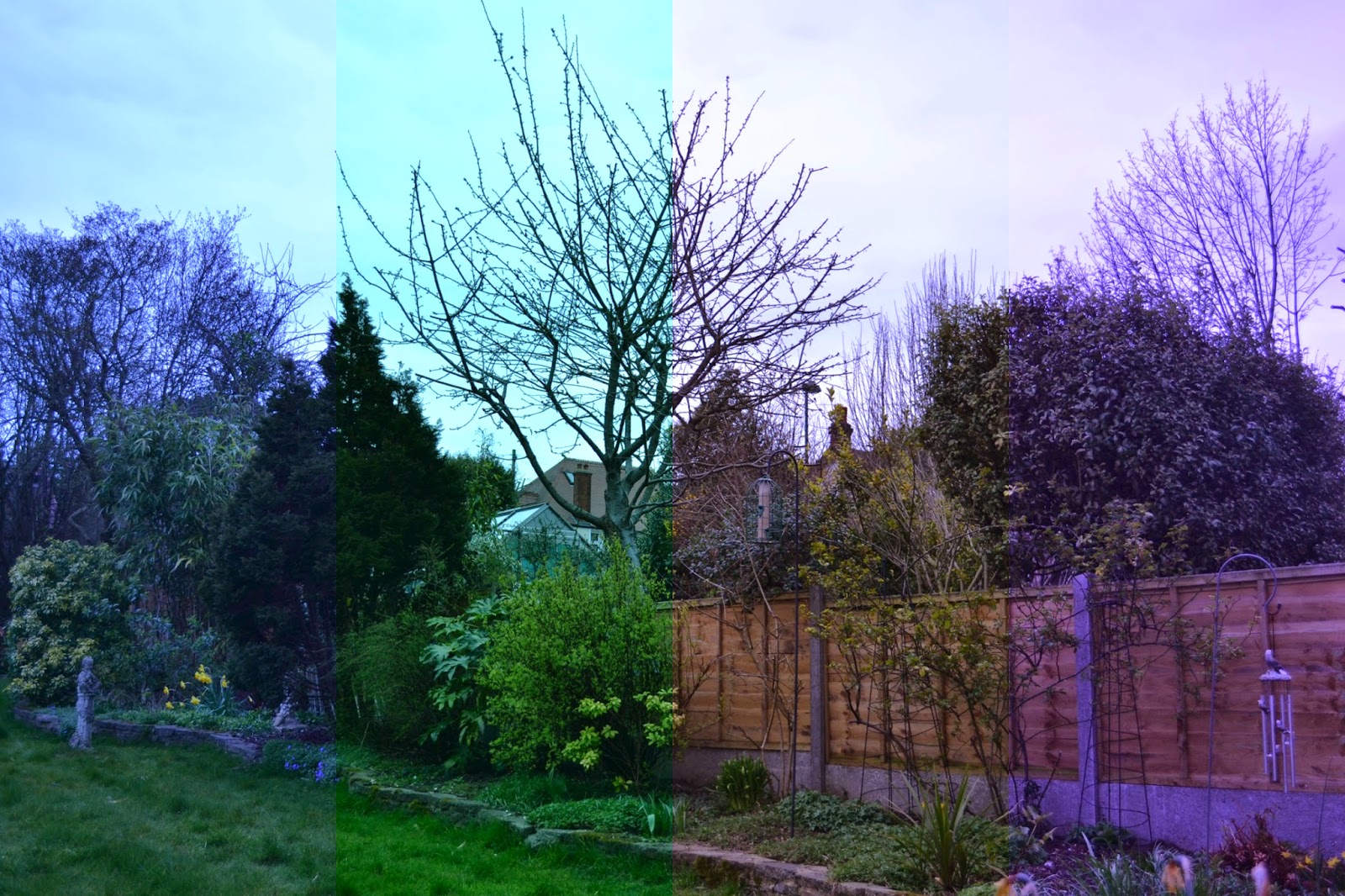
Cool-white fl.
Day white fluorescent
Daylight fluorescent
Mercury-vapor lamps
Direct sunlight
This would probably be the usual setting to begin with however I have adjusted the colours to be the maximum that they could change to if altered. However if this was just left at the centre of the B, G, A and M grid, it would balance the whiteness of the photo to give an actual representation of the colours.
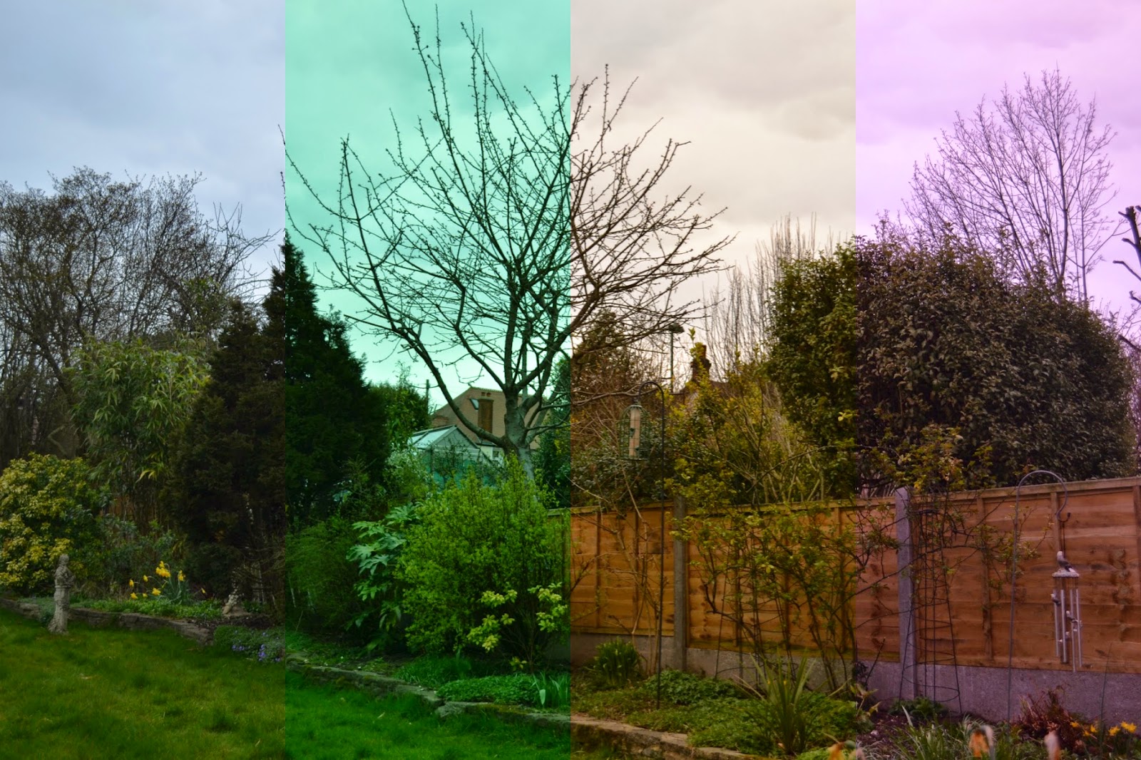
Flash
Cloudy
Shade
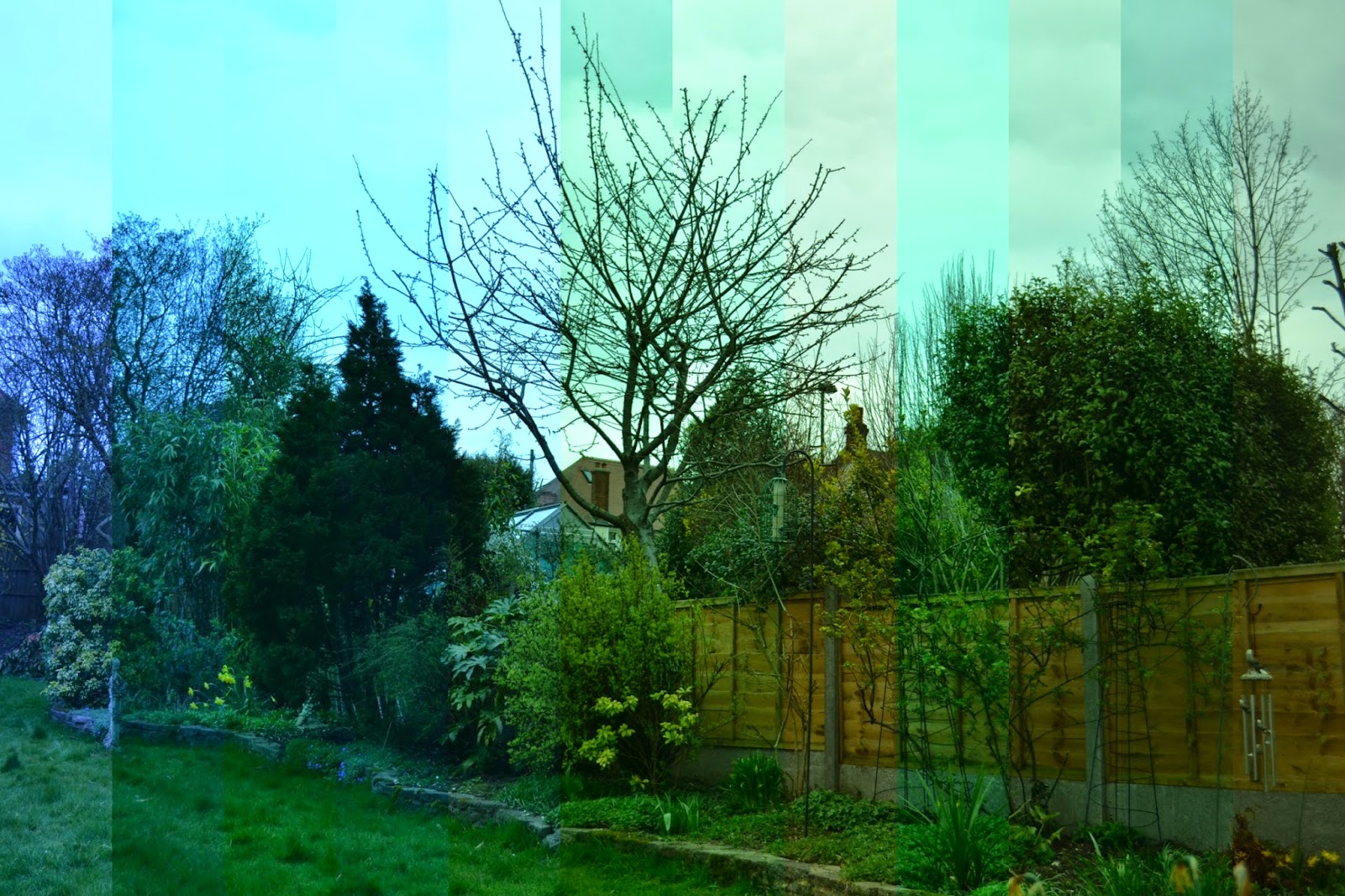
Warmest colours here, as we can see the B section (far left) of the photo is far from the blue cool tones we had when using the incandescent setting.

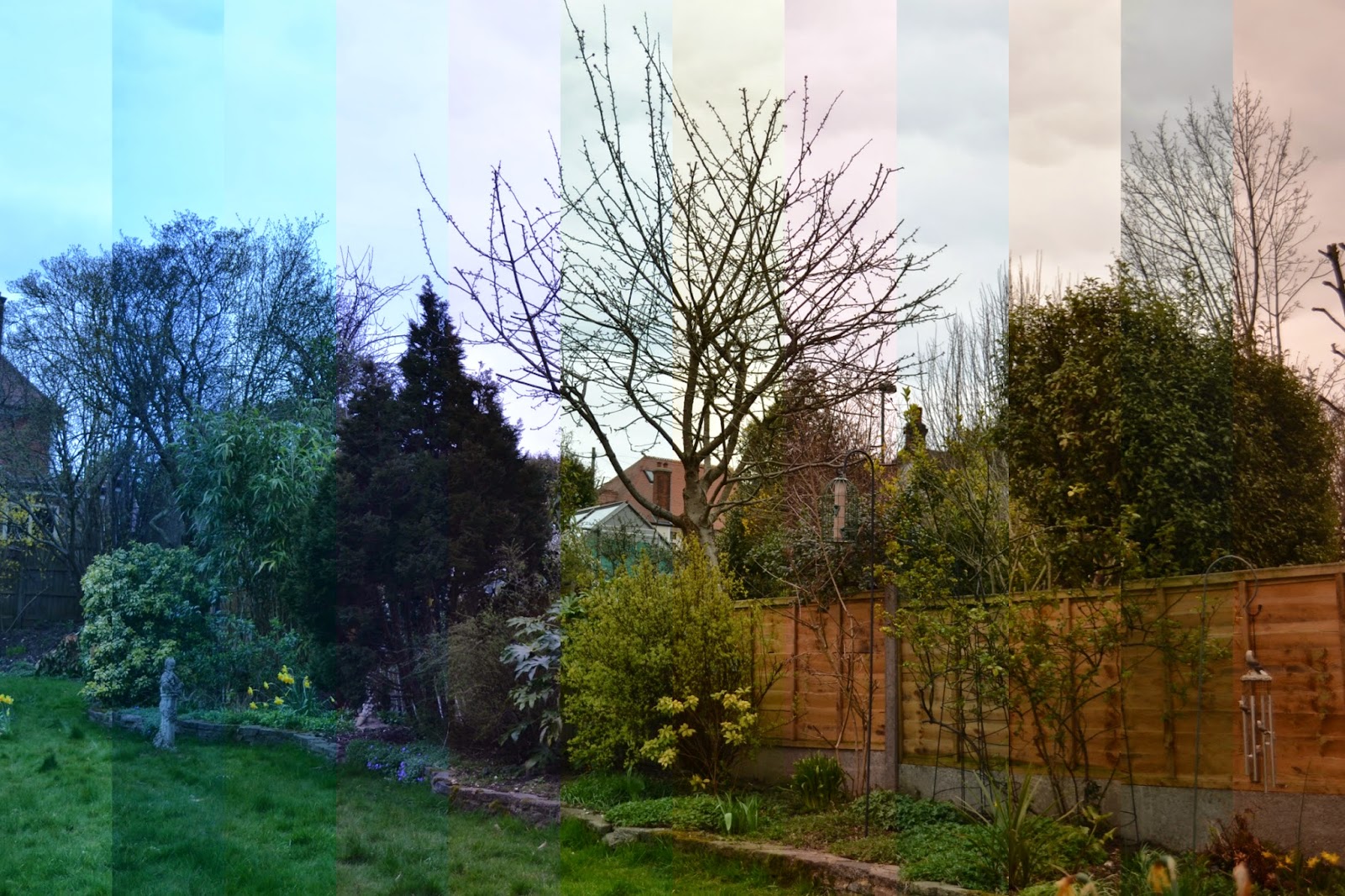
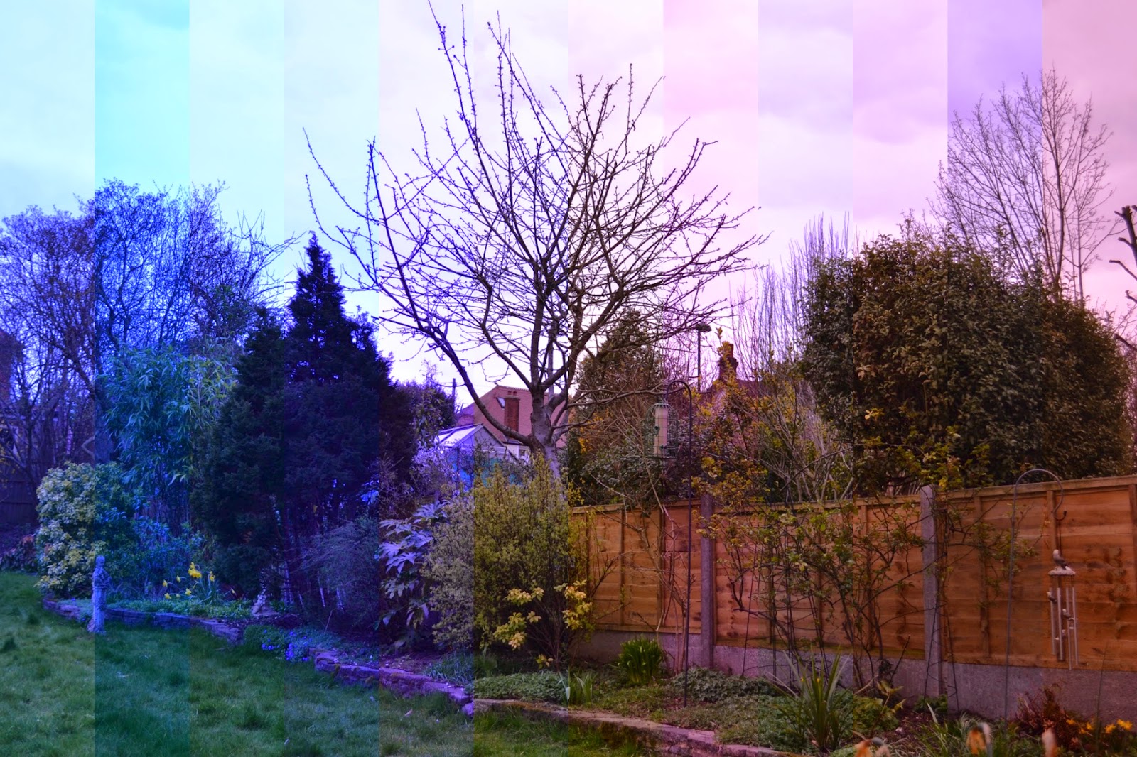
Collages below show the B, G, A and M settings on each option (e.g. incandescent, direct sunlight etc) separately so you can see how each quadrat of the grid gives a different shade. (The strips of the photo start from left with incandescent, sodium-vapour lamps, warm-white fl., white fluorescent, cool-white fl., day white fluorescent, daylight fluorescent, mercury-vapour lamps, direct sunlight, flash, cloudy and finally shade).
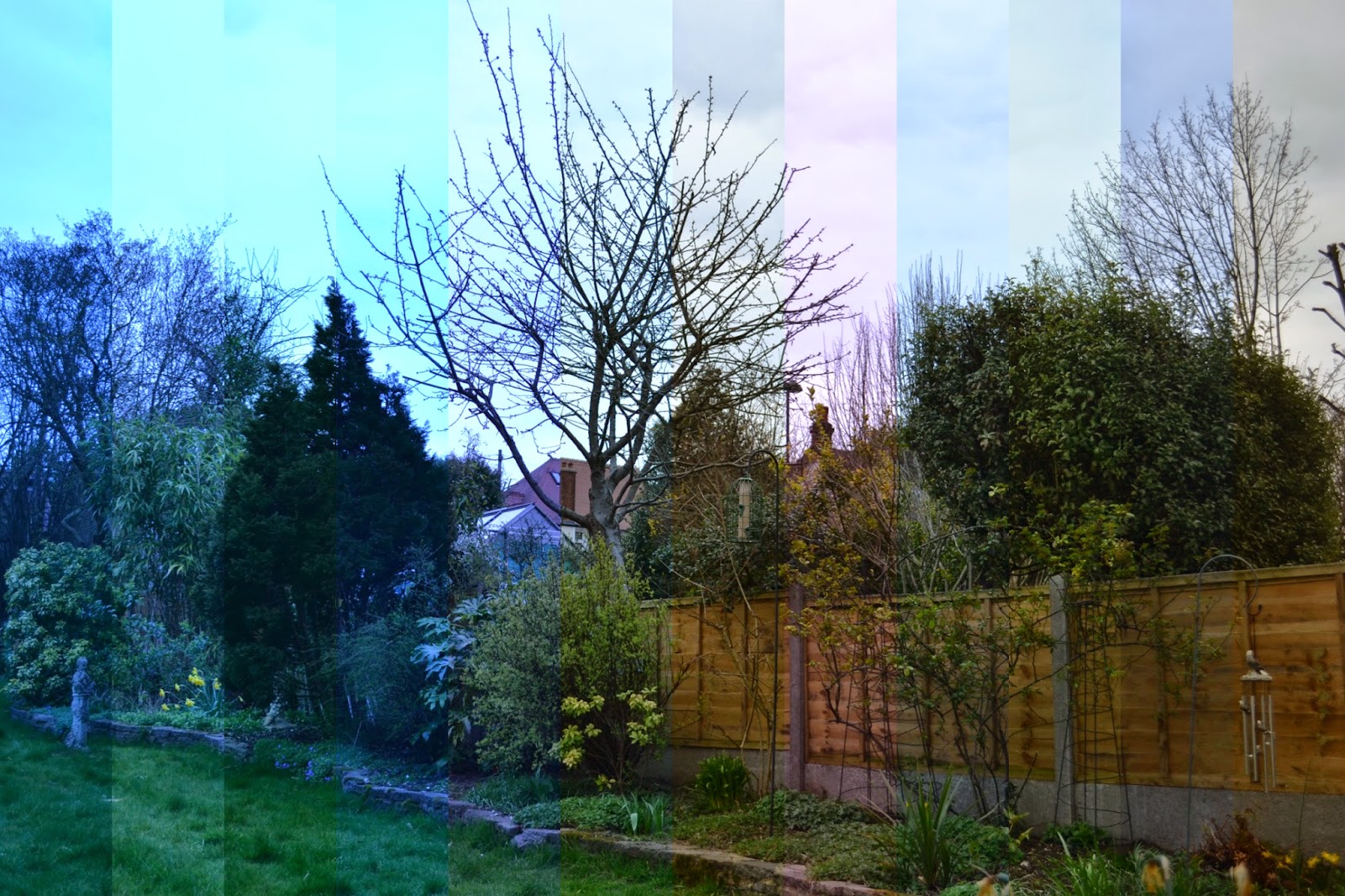
Setting B
Setting G
Setting A
Setting G
Wow, a big thank you to you for reading this far to the end of the post. Awfully sorry for the fact that it was so long winded and that it made no sense whatsoever... it is very hard to simplify white balance and all the tricky pathways within the camera to get to the point that I was talking about. But thank you all the same if you stuck to it. Gold star for you.


Monday, 6 April 2015

Sweeney Todd at English National Opera

   A slightly different post to the usual photography nonsense I talk about, but after attending the Sweeney Todd performance at the English National Opera in London, I thought I would review the performance. Music and lyrics by the outstanding and well-credited Sondheim and direction from Lonny Price, created a timeless piece with an interesting twist due to the formation of the set. This was primarily down to James Noone who designed the set, or should I say lack of set (we'll get back to this later). With outstanding vocal performances from Bryn Terfel (Sweeney Todd) and the wonderful Emma Thompson (Mrs Lovett), it was impossible not to compare their chemistry, delivery and vocals to the very well-known, critically-acclaimed Tim Burton movie starring Johnny Depp and Helena Bonham-Carter - which sadly is not where the story even originates. 

   Starting with a review of the performance, the cast definitely did an outstanding performance. The lyrics were incredibly humorous and it was one of the most audience involved musicals I have been to with the cast really reacting and responding to the laughter from the audience. It made the whole event seem rather relaxed and comfortable and limited the distance between the characters and the general public. Emma Thompson was undeniably the focal point for the majority of the musical, with her amusing and comic character gaining the attention of the audience and several round of applauses for not just her singing but her entertaining actions as well. 

Photo by ENO
   Sadly myself and my family has tickets for the balcony, which automatically puts us at a disadvantageous height from the stage - partly because of the distance, partly because of the sheer height of it (would not recommend if you have vertigo). In spite of this, the set and the stage usually accomodates for this and tries to alter the positioning of the actors slightly so that they are more viewable to the people at the top. However because of a very unique and different set this option was not available. The stage was made up of the orchestra on the stage taking up the majority of it leaving little space for the actors to move around. This was adjusted by extending the stage slightly over where the orchestra pit usually is but sadly this meant that the balcony could not see the edge of the stage meaning that when the performance came very close to the edge we could not clearly make out what was happening. This in turn caused everyone to be sitting very upright and forward causing the row behind to do the same and so on, so that you could see. 

   However, there were some positive aspects to having the orchestra in the centre of the stage as it meant that there was a level of comedic interaction between the performers and the musicians. For example, Mrs Lovett ordered one of the cellists to give up their seat so that she could give it to Sweeney for his barber shop and when she stole the baton from the conductor, there was an uproar of laughter. It also brought about levels due to the minimalistic nature of the set as it clearly showed the lower level - Mrs Lovett's pie shop - and the upper level - Todd's barber shop. This was beneficial in showing different scenes because the stage was lacking an elaborate set which was rather sad because often performances as large as these you expect something far more extravagant. 

Photo by ENO
Photo by ENO
   Overall, the performance was very interesting, and I have to admit that the colours worked rather well in the end, as I had originally thought that the red dress was not going to fit with the theme of the musical (it is set roughly in the 1890s). However by bringing the colour into the very bland and dark set definitely drew the centre point to Emma and made her stand out amongst the rest of the choir, performers and musicians. However, I was confused by some aspects such as the modern graffiti, featuring the works of Stik (one of London's most influential current street artists) in the background of the set, as well as words such as 'you are now entering Protestant territory'. Well we know for sure that this musical is set in London not Ireland, so I have no idea what that was about. Nevertheless, it did spark some thought process and gave a bit of interest to the simplistic set.

The performance has been running from 30th March and will finish in several days on the 12th April. Sadly, all tickets have been sold and I was very fortunate in getting mine when they added an extra matinee performance on Easter Sunday. However the website says that there will be 55 extra seats added across the house to buy on the each day of every performance at the Box Office at 10am ranging from the cheapest ticket price at £10. If you are not tempted by the story, at least be tempted by Emma Thompson and the venue - it truly is extraordinary. 


Wednesday, 1 April 2015

My Polaroid has been one of the best presents I have ever received. I love the instant moment of the photo being developed and I love the washed out, not quite perfect feel it has to it. I think there is something special in just capturing a moment once and not knowing how it will turn out - each photo becomes a one off and is significant to that moment.

The Polaroid itself is very easy to use, and it helps that it has a sensor to allow you to move between different settings depending on the lighting situation. Obviously the quality of the photos aren't quite perfect - features aren't too defined and the camera also cuts out some of the bottom of the frame so you have to overcompensate by pointing it down a little or else you get loads of space at the top of the frame. But nevertheless, they still look effective.

I purchased mine from Amazon, the link is here however you can also purchase them from the Polaroid store or Urban Outfitters but they seem to be a lot cheaper on Amazon. Sadly the film is rather expensive, around £14 for 20 films, if purchased on Amazon here which works out as 70p per film. When you think about it 70p doesn't seem too bad but 20 films can get used up pretty quickly when you are taking photos of friends or places so the cost builds up.

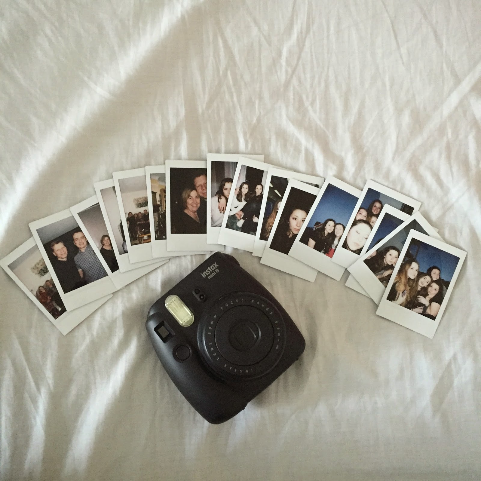
Frankly for me, the cost is worth it - I love the outcomes and I can treasure them forever and it's such a handy little camera to have out and about for special occasions. Below I've included photos of my Polaroid and the photos I have taken on it.


Popular Posts